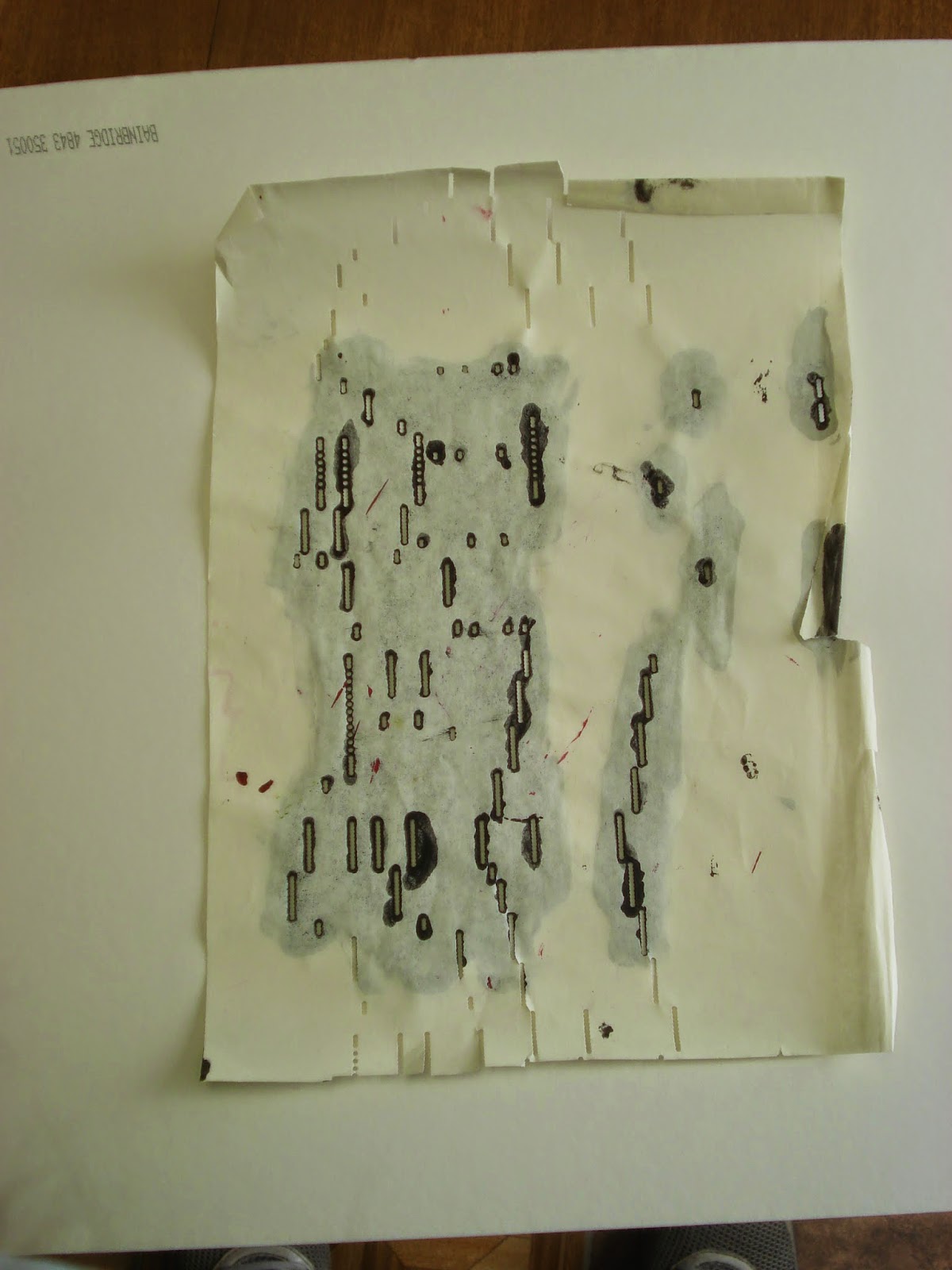

*(I used the extra paper as a stencil for some background design, pushing paint into the slots and circles. Pouncing with a sponge or paper towel would have given sharper results, I realized afterwards.)
The lyrics on my piece, printed in blue capital letters from bottom to top on the right side, read "TAKE MY LIPS I WANT TO LOSE THEM." At first I envisioned a "Lips-" themed page until a vintage advertisement became the focal point. Funny how art projects, like novels-in-progress, sometimes take on a life of their own.
Combining red and purple paints, I spread them across my blank journal page for a background, then added black circles and slashes *. I cut out and saved the words from the excess music paper for later use.
A pile of hand-made papers in the center of the table caught my attention. Ripping strips of a solid burgundy piece I fashioned a rough frame for my page. Burgundy and green textured/dyed paper squares cut into triangles fit nicely along the edge of the page.
I glued in all of the cut-out words from the extra music paper, knowing I would probably have to add words of my own to come up with a coherent message.
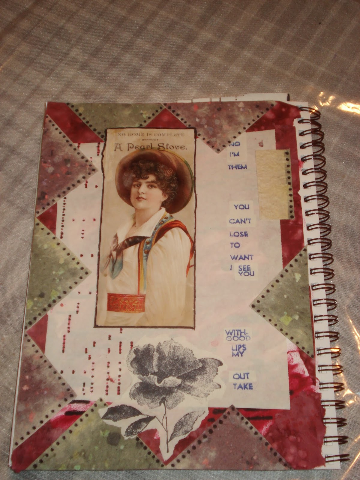
The instructor offered me a rubber-stamped image (Never refuse free art stuff!) which immediately found it's place bottom-center. I used a black Sharpie pen to fill in some of the player piano paper slots and dots, adding penned dots along the triangle edge pieces.
This is what I took home with me from the workshop.
Later, I pressed small square ink pads onto the paper triangles. Two fish images emerged (see image below, top right edge), an unexpected, happy result. I filled in the rubber-stamped flower image with water color pencils
With a fine-line blue permanent I supplemented the text, doing my best to mimic the font already there.

It turned out much different than I could have envisioned. Just one thing strikes me as odd: the boy in the vintage advertisement seems to resemble someone notorious in the current news... Maybe it's just my imagination.
No comments:
Post a Comment